Saturday, 29 June 2013

Waterstones and the Changing Bookselling Environment in the UK: the Journey so far and Prospects Uzoechi Nwagbara


This article is about marketing analysis in Business for bookstore-Waterstones. Writter talk about SWOT from different ways to think Waterstiones’ situation. In article, he has mentioned that Waterstones mission statement:

“Waterstone’s mission is to be the leading bookseller on the High Street and online providing customers the widest choice, great value and expert advice from a team passionate about Bookselling.
Waterstone’s aims to interest and excite its customers and continually inspire people to read and engage in books” .

To my project, I chosen Waterstones as object to find a new way for window display of bookstore.so I will extend Waterstone’s mission to link my design – the content of Waterstones window display. Because Waterstones provides widest choice, great value and expert advice, it means Waterstones like universe has various books and visitors can read great stories in Waterstons. As we know, good stories can give reader amazing experience, like readers go into an amazing and imagined world which is different with real world. Through presenting this idea in window, the store’s face, to engage people experience outside, whilst to achieve Branding Culture Value, thereby building relationship with consumers. 


Link:
Uzoechi Nwagbara, 2011, Waterstone’s and the Changing Bookselling Environment in the UK: the Journey so far and Prospects, 

Tuesday, 25 June 2013

25/06/2013 Tutorial


Today, we have discussed about concept of bookstore model-box. The bookstore window design for viewing use angles and perspective(optial illusion) to got a pattern, by this way to engage passer-by experience.
The window display of Waterstones consist of two parts. Firstly, discussion the open space of window – the background. the window theme is the world of book, because books contain too many knowledge and storise, It is unlimited. Meanwhile, reading book can improves people’s imagination, so the background use sky/space as metaphor to express wide and unlimited concept, those characters of book is similar as sky.
Secondly, we talked about confined space,  According to “world” to conducte brainstorm, so I got some keywords. I picked up three typical words, they are nature, society and people, using related elements to link the books’ world. This part is for peephole experience, so we discussed the interactive device, like putting button on window, except for the confined space(the box) have holes to engage people curiousity to close window, and people can interaction with window to get fun when they see that.

Friday, 21 June 2013

open space and confined space


the window is distinguished two parts, open space and confined space. to open space, I go to google to research some pictures about "The world of book",

the world give people the first experience is wide, and book likes universe contains many things, it is also too wide. so I got the idea in below picture,

draft
in oder to express the characteristic of bookstore, the pattern 'V' in window is book which is opening. I put two same patterns together to consist the world 'W'. the reason is this window display is for Waterstones, the capital of word is 'W'. it can emphasis Waterstones brand identity to give passer-by a clear message.

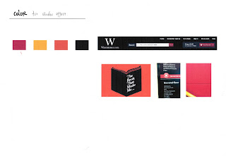
I went to Waterstones to observe the environment, and pick special color for Waterstones to make the window display integrate with normal environment.


so graphic effect:


and quote the famous quotation to show the theme.

"A book, too, can be a star, a living fire to lighten the darkness, leading out into the expanding universe."  ----Madeleine L'Engle


Wednesday, 12 June 2013

11th June 2013 Tutorial feedback


Today we have checked the plan to discuss what I have done before.  We talked about the scale for model-box to make sure the scale is more professional, and to distinguish what different between low-fidelity and high-fidelity.
We have discussed window display and content for bookstore. To display form,  the idea is creating two layers scenes about book( open space and  confined space). For open space , people can see it in long-distance, and for confined space, the box maybe have few holes people should close window through the hole to see inside space.  We  also talked  about content and mentioned a whole and parts scenes, i.e. from open space to confined space. to make this two parts can link each other and think what content can engage people’s attention to close window, thereby  promoting the relationship between people and brand, (e.g. Apple).  And we have mentioned to use kaleidoscope to enhance the visual language, but if I want to use it, should think about how to use kaleidoscope to link bookstore.

Saturday, 8 June 2013

Data about model


the audience of my project is adult and children, because window display form has two parts,  generally, the height of box one is for child and upper part is for adult.   

and also based on the below picture


I got the box height,which suit for audience to see it.


and at top of box is incline, it should fit people's visual scope, so I have research Ergonomic design about vision part, to got a suitable angle for people's eyes.


theory 

box height