Tuesday, 25 December 2012

Bookstores in different countries


there are some bookstores window display in different countries which I found in website. through researching and comparing to know what bookstore situation in UK


UK


Paris


Brazil
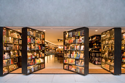
Paulo, Livraria da Vila

New Zealand


USA


Sydney


Canada


Portland

Sunday, 16 December 2012

12/12/2012 Tutorial


Today, we discussed the learning agreement and methods and methodology in Art and Design.

Method is the tools which you use it to measure your project. why you choose that, and how can it help you.
 
Methodology is why you used that tool, what are you trying to figure out and solve.


we discussed:

- to reset and complete more details about my subject scope. According to Lucy Johnston (http://folksonomy.co/?permalink=3080), to prove retail environment is important in physical consumer experience. 

- finding and using different evidences to prove why i choose my project( visual merchandising).

- using cultural probe in methodology to think space design how to engage people's experience.    

- to think how to arrange questionnaire to got useful information. 
- to thinking what the display will be look like in contemporary and future.


Things to do and look:
- completing my learning agreement

- reading materials to know what is the method in Art and Design.(http://www.upv.es/laboluz/master/seminario/textos/Visualizing_Research.pdf )
- to know what is cultural probe


Friday, 30 November 2012

Exhibition Design by Holzer Kobler Architekturen

Design is unlimited, we can find new ideas from Exhibition design to use in window display. so this article is a good example to help me thinking how to create window display for bookstore.


                                                  Warning: Communicating is dangerous


"Warning: Communicating is Dangerous" is an aid to better living. Visitors enter the communication clinic and are immediately confronted with a problem: the deluge of information that washes over us every day, represented visually in the form of a library. Their case history is examined and they undergo a check up, after which their personal 
communication index is calculated. While waiting for their results they can relax in the discreet and confidential atmosphere of the waiting room. Finally, four personalised wellness packages are prescribed as an immediate response. As they leave the clinic, visitors are handed their medication: “comucaine”. The information leaflet enclosed summarises the most important tips for communication behaviour.http://www.holzerkobler.ch/en/theme/exhibition+design/post/95 )


                                                                       BAU.ART.Thüringen 
 

The exhibition design of BAU.ART.Thüringen is informed by the shell of the heating plant in which it is   housed, using typical, very simple construction materials to mimic the austere style of the building. The exhibition concept includes an information section in the foyer of the plant and a vision section in the boiler room.   ( http://www.holzerkobler.ch/en/theme/exhibition+design/post/125 )


                                                                 A History of Forest and People


As you stroll through the woods, your senses are on high alert: you gaze at the forest floor, raise your eyes to the heavens, peer around the next tree or seek out the ground beneath a root. We made such a principle of playful discovery part of the exhibition space, and filled the white surfaces of an entire screen with content as abundant, dense and multifaceted as the forest itself.
......
The many layers of the display enact dramas whose props are objects, models, images, media presentations and games, and the emotional and poetic production captivates a heterogeneous viewership, from children to nature lovers. http://www.holzerkobler.ch/en/theme/exhibition+design/post/32 )


                                                                   MISE EN SCENE <EX 545>


“Scenography and architecture tell stories about spaces. As we move through spaces we constantly perceive their architecture from new points of view. Architecture is never constant: it is in continuous movement.” --- Barbara Holzer and Tristan Kobler

Exhibition design is concerned with the issue of transformation. The scenographer must reconfigure an existing space: no place or location is neutral. The transformation is closely linked to the content, and that changes with every exhibition. The same applies when we design a building. Who can predict whether an office complex will always remain an office complex, or an apartment house always an apartment house? Exhibition design teaches us how to approach transformation, which is a fundamental element of architecture. It shows us that people never take an aerial view of architecture but always see it at eye level; and the way in which a person moves through a space is crucial. Our view of that space is fragmented, our perception of it a series of discrete impressions.

http://www.holzerkobler.ch/en/theme/exhibition+design/post/54 )


Wednesday, 28 November 2012

Lecture: MANAGING CREATIVE DIRECTOR FUTURE BRAND


Following the development of the times, designer try to create/re-create stuffs to make people's lives better. Actually, it depends on human themselves. Designer try to find same things and share common to built relationship between human and product. like color, black associate with power, elegance ... through metaphor to present product.
     
Pete has indicated that the designer create a Future Brand should do 3 steps, which is foresight, co-creating idea and design vision. and he also mentioned that the role of 'semiotic' is very important in creativity. Semiotic gives people visual, verbal and experience... to define category. we should understand where stand within our category, and try to understand the rule, then borrow it to get ideas and transcend it.

In the future, we will live in the world of global connectivity, ageing population and grin technologies etc.. how to make products more attracting, Pete has presented an idea of 5 senses..

sight           hearing             touch             taste          smell
    
such as 

- 75% emotion by smell

  baby is mainly depend on smell to identify different things 


- taste  
 
  color and shape


- eat
 
  sound


As we know, when people see a brand, most of people will pay attention color first and then shape.  So according to research human's actives and experience through the combination of senses to make result maximize


Pete Hollingsworth
consumer at Future Brand
http://www.futurebrand.com/

WHY BOOK STORES ARE CLOSING


this article can be the background and resource for my project, to analysis the situation of bookstore. 


Author: Carl King    Topics: Business,Marketing,Totally Original Ideas 
http://www.carlkingdom.com/why-book-stores-are-closing


A bookstore is An Environment For Discovery. A Gallery of Written Ideas.
For those of us who have been disillusioned by formal education, book stores have offered an escape: a place to stumble onto new shit.
Since way back in high school, when I’ve needed creative juice, I’ve take a random stroll through a book store… to raise my awareness, study independently, and find inspiration in unexpected places. I’d sit down with 4 or 5 books at a time and dig through them. I’d usually go home with at least one.
I’ve purchased around 500 non-fiction books in my lifetime. I can’t put a price on how much I’ve learned from them. It’s millions of dollars worth of knowledge. And it wasn’t only the time I spent turning pages and moving my eyeballs. It was the time I spent staring into space, sitting on the floor of the book store, digesting alien ideas, wondering if this was the book that was going to reveal its secrets to me.
Say what you want about how “books are old media.” But there’s still something special about printing words on paper. It says “these words deserve to be here.” Anyone can make a PDF. It’s when you realize that even the copied words are worth killing a tree or squeezing an octopus.
But it’s not just the book, it’s the experience of being in the book store that matters. Instantly ordering and downloading exactly what you want with one click is not the same — and if you think it is, you’re one step closer to living in the fucking Matrix.
So long as people have physical bodies, GOING TO PLACES and DISCOVERING NEW THINGS THAT YOU CAN TOUCH will matter. That can’t happen when everything is linked and indexed and blurbed and reviewed and meta-tagged into sterility. 5,278,945 people Like this? Who cares?
Chaos must be involved. The element of surprise.
Me? I go to the book store to find what I’m NOT looking for. I want the book that I see out of the corner of my eye, just a few letters of the spine showing on the top shelf. Way up there, hiding from me. Probably in the wrong section, something I’ve never heard of. I don’t know who else has read it, and I don’t care. (Coincidentally, while writing this blog entry, I used some writing techniques I learned from The Art of Nonfiction by Ayn Rand — which I discovered during the above experience last weekend.)
If I only read books that I’m looking for, they’ll tell me what I already know. What good is that?
I admit… that was getting harder to experience, because there are too many published books to keep in one store. Only the cheesiest, pot-boiling easy-sellers were kept in stock. I’d see several square miles dedicated to a bullshit biography on Lady Gaga (or some other pseudo-celebrity that’s “famous for being famous”) while anything published more than a week ago was in Clearance. That is, unless it happened to be on a required reading list — and we know all those books are time-honored crap for conformists.
Sad.
Why not go to the library, then? Because their collection is made of whatever people decide to abandon, stuff they couldn’t even give away.
There must be a solution, right?
Boutique shops like Writers Store in Burbank have figured that one out. Nurture a community (give seminars, panel discussions), stock the best products and tools for a particular profession (writing), and most importantly — make people feel inspired. I always think, “Just by walking in here, I’m a real writer.” Makes me wanna go home and get to work, but not before I buy something to thank them.
I think Private Libraries are another fantastic business idea. Old books, new books, it doesn’t matter — as long as they’re personally-selected for a devoted audience. Instead of coffee shops, why not pay to hang out in a media library personally selected by the Coen Brothers or Kevin Smith? Go there and study all day. I think we’ll be seeing those popping up in the future. If I’m lucky.
Let’s hope that the businessmen behind book stores grow to understand what a book store is really about, and can turn this all around. I repeat: it’s not about selling widgets. I’d hate to see book stores go extinct because they can’t understand that simple premise.
Wednesday, 21 November 2012

about Space

space is in everywhere, it can bring fantasy experience to customers. there are two articles, through different aspect to discus the important of space.  one point thinks functionality is prized more than experience,

"non-places: when functionality is prized more highly than experience"


""But the real non-places of supertnodernity - the ones we inhabit when we are driving down the motorway, wandering through the supermarket or sit-an airport lounge waiting for the next flight to London or Marseille - have the peculiarity that they are defined partly by the words and texts they offer us: their 'instructions for use', which may be prescriptive ane'), prohibitive ('No smoking') or informative ('You are now entering the Beaujalais region'). Sometimes these are couched in more explicit and codified ideograms (an road signs, maps and tourist guides), sometimes in ordinary language. This establishes the traffic conditions of spaces in which individuals are supposed to interact only with texts, whose proponents are not individuals but `moral entities' or institutions {airports, airlines, Ministry of Transport, commercial companies, traffic police, municipal councils); sometimes their presence is explicitly stated ('this road section financed by the General Council', 'the state is working to improve your living conditions'), sometimes it is only vaguely discernible behind the injunctions, advice, commentaries and 'messages' transmitted by the innumerable 'supports' (signboards, screens, posters) that form an integral part of the contemporary landscape. France's well-designed autarautes reveal landscapes somewhat reminiscent of aerial views, very different from the ones seen by travellers on the old national and departmental main roads. They represent, as it were, a change from intimist cinema to the big sky of Westerns. But it is the texts planted along the wayside that tell us about the landscape and make its secret beauties explicit. Main roads no longer pass through towns, but lists of their notable features - and, indeed, a whole commentary - appear on big signboards nearby. In a sense the traveller is absolved of the need to stop or even look. Thus, drivers batting down the auto route du sud are urged to pay attention to a thirteenth-century fortified village, a renowned vine-yard, the 'eternal hill' of Vezelay, the landscapes of the Avallonnais and even those of Cezanne (the return of culture into a nature which is concealed, but still talked about). The landscape keeps its distance, but its natural or architectural details give rise to a text, sometimes supplemented by a schematic plan when it appears that the passing traveller is not really in a position to see the remarkable feature drawn to his attention, and thus has to derive what pleasure he can from the mere knowledge of its proximity."


"(Marc Augé pp.96-97))


another point thinks effective physical connection can enhance brand success. which can bring good experience to customer.

Plug and play: the 'new purpose' of physical consumer space 


"an effective physical connection is still absolutely imperative to brand success. Rather than assuming that the physical space is being hindered by the growth of digital activity, brands and designers are beginning to embrace the newer channels where consumers are choosing to spend their time and deliver a physical environment that adds value around these. Get the basic understanding of the 'new purpose' of the physical space right and the physical manifestation of the design will boom from there. The key is to design interiors that can respond and morph with social and cultural shifts, so that the spaces become a form of 'cultural commentary', adding value to the popular activities of today's audiences. Above all, interior design must be approached in a way that ensures that the brand communicates a relevant message through this critical channel. This can be achieved by considering and responding to three key topics: cultural relevance, social context and technology integration." (Lucy Johnston, Design Week) 


Sunday, 18 November 2012

THE TRIP OF IMPERIAL WAR MUSEUMS

Friday 16 NOV. 2012,  Manchester


the display of Imperial war museums is very wonderful to me, we can experience 360
degree flights around the building on whole wall. the sound and vision have shocked my heart.


Time stack is an interactive display, people should push a button to view a tray. the whole display have 8 layers in this tray, each layer through a button to show, it is similar to transformer.

game -- touch & play


Wednesday, 7 November 2012

Experience Design in different fields

Design is central to the shopping experience, it can engage people experience to communication with brand, thereby provoking them to purchase products.
there are some examples to analysis experience design in other field is how to use.  
 

Adrift in a shopping maze: it's successful no-exit strategy


"Penn went on to suggest that it was Ikea's strategy to keep customers inside the store for the maximum time possible. They achieve this by setting a route round the store from which it's difficult to deviate...
The effect is to boost impulse purchases. See a coathanger, and you might buy "because the layout is so confusing you know you won't be able to go back and get it later".


even though, IKEA, this example is not about visual merchandising, but the idea can be a reference to bring some ideas to me to develop bookstore window display.

and other example is for museum, this museum bring 360 degree fights around the building on a giant screen. it brings an amazing vision and experience to people.


Museum Beneath a Hotel: Settlement Exhibition Reykjavik City Museum


"ART+COM was awarded the contract to design a holistic media concept for the City Museum of Reykjavik. During the excavation works in 2001 for a hotel in the centre of Iceland's capital, the oldest proof of settlement in Reykjavik was found. The ruins of a longhouse and of a turf wall can now be visited "on site": The museum is situated in the basement of the new hotel; the longhouse's former main room is part of today's exhibition hall.
An interactive media installation presents the ruin, dated around 930 AD, the way it probably looked when occupied. The Multi-User installation resurrects the inhabitants as ghosts and shows them in their daily activities. The pater familias is welcoming a guest, servants take care of the livestock and the kitchen, the housewife is dyeing cloth, a child is playing. Museum visitors gain information by activating texts and images telling more on life in Iceland's Middle Ages. A spot light is also directed onto the relics found in the ruin. Touched by the visitor, they will show where they were located in the longhouse and explain their function. Additionally, the purpose of the building's different rooms is described."

and the example of experience design is about window display for cloth shop. designers use digital technology to create interactive window, which can follow passerby step to make window screen to play.


 WESC Interactive Window Concept


CLIENT: WeSC

BRIEFConnect the brand to music and/or art with the purpose to engage, entertain, impress and create a feeling of wanting to know more.The end goal was to create an impression so great the receiver would want to be the first one sharing the experience.

link: http://cargocollective.com/bareilza/INTERACTIVE-WINDOW-CONCEPT

Tuesday, 30 October 2012

Visual Merchandising, History, Now and Future


Visual merchandising had started in nineteenth century, the propose is attracting more customers to purchase products.

this article will show window frames in different periods and think what's window displays look like in the future.
....

-  1915
Macy's Toy Window Display, New York

-  1920
Selfridges window display, London
- 1956
WTU Diamond Jubilee Window Display

- 1967
Regent Street Window Display, London 
    .....
this period, many stores and department stores have developed, the demonstration of window display gradually changed from a simple display goods to the use of visual design and mannequin to attract customers to see and buy stuffs.


- 1997


this project has made by Heatherwick Studio, Harvey Nichols, a renowned department store in Knightsbridge, London. this installation, named Autumn Intrusion in order to celebrate London Fashion Week 1997.

actually, I think Harvey's idea will bring a new opportunity in window display in the future. 
http://www.heatherwick.com/autumn-intrusion/

- 2005
  Macy's Herald Square by Paul Olszewsk, N.Y. 
not only using mannequin to present products, but designers add some props to make window displays more colorful than previous period, through telling a story or giving a people familiar scene to catch passerby's' eyes.


- 2007
Selfridge surrealism window display by Rolf Sachs |  Smythson, by Zoe Bradley in Lonndon
Apple Computer holiday window review | Holiday window display By Anne DiNardo 
to begin to use different materials and forms, like paper and light to demonstrate goods, and to add some drama and scene to make window frames more interesting.


- 2008
Selfridges windows  | Tiffany, fantastic fairy tale, by Zoe Bradley  |  Italian Fusion By Angelika Frank  |   Europe A Sneak Peek for Fall
Apifera in selfridges, by Matthew Plummer Fernandez  |  Bergdorf Goodman Post-It Art djjjjjjjjjjjjjjjjjjjjjjjjjjjjjjjjjjjjjjjjjjjjjjjjjjjjjjjjjjjjjjjjjjjjjjjjjjjjjjjjjjjjjjjjjjjjjjjjjjjjjjjjjjjjjjjjjd
following last year creative ideas, paper arts has became a main trend. designers have begun to use new technologies to make window display to move and more aesthetic.


- 2009
Woman with a dream, by David Lynch  |   Lanvin's Paris   |  Bergdorf Goodman Windows
Sony Style, New York  |  Flights of Fancy, By Angelika Frank | The Artek '10-Unit System' by Shigeru Ban
during this period, designers have created a large number of drama presentations to make window display to look more fun and interesting, meanwhile some window frames not only using visual presentation but also creating sound. it can catch people's eye easily and make window frame become an art gallery through using different design techniques.


- 2010
Maison Hermès window display, by tokujin yoshioka, Japan | Spectacular window display, by Lernert & Sander | Paul Smith window display
Game, brabants kenniscentrum kunst en cultuur | Recycled To-Go Cups, by Indo Project | book store by senior bookseller Justin Rowe 
some window frames have more conceptualize, like Recycled To-Go Cups made by Indo Project, window just demonstrated an art form which maybe contact with product, but didn't put products in window. and using scale and transformation or other art methods, while becoming to think people's experience to create window display, such as Maison Hermes window display, Japanese designer, tokujin use people's behavior to stimulate people's interested.


- 2011
moncler flagship store soho, U.S.A |  Richard cadan, N.Y. | Holiday Windows Review By Whitney | Holiday Windows Review By Whitney
LSI/Gene Moore Award Competition  |  VMSD Visual Competition  | By Whitney Harrod | Interactive window display By cyril foiret
designer have created fairy scenes through colorful lights, and not only limited in window, a few of displays have created 3D. and more and more designers have used interactive design such as adopting touch and hearing (5 senses http://mengruozhaoxi.blogspot.co.uk/2012/11/managing-creative-director-future-brand.html ) to create window display, which make people can communicate with window, thereby attracting passerby's interested.


- 2012


by Chairman Ting  | Issey Miyake by Drawing and Mannual, Japan | dot screen, Breakfast for TNT in N.Y. | Happy circle and angry triangle
Future map selfridge by studio xag | by Kyle Bean | Broken window shop Optical illusion Apple for iPod Hi-Fi
Ted Baker for Chelsea in Bloom festival  | Lanvin birds of paradise paris | Hermes green spring, Paris | Perfume & skin care
comparing last year to this year, designers have begun to use a number of visual design, experience design and new technologies, like screen, moving installation, to present dynamic, meaning window display through the combination of different materials to attract people.

.....

in conclusion,many window frames usually put products in window, which have a glass separate products and people. I think the trend of window frame can open window or create 3D in the future, whatever by projection or transform window structure.


Monday, 15 October 2012

visual merchandising

(supplement something lose before)


Visual merchandising is the activity and profession of developing the floor plans and three-dimensional displays in order to maximise sales.[1] Both goods or services can be displayed to highlight their features and benefits. The purpose of such visual merchandising is to attract, engage and motivate the customer towards making a purchase. (wiki)


Visual Merchandising include Window display, Interior point-of-sale display and Special promotions ( or retail store and trade show).  

window display is a form of visual merchandising and it is not equated to visual merchandising.


Thursday, 11 October 2012

Purpose


This blog is reflective journal for my MA project at Nottingham Trent University. it will record my research process and summary, creating a time line to know how I develop my idea from beginning to the end.

Wednesday, 10 October 2012

JOURNEY & DESTINATION


visit nottingham
The family of clay people

Finally, we have finished our group presentation. it is so wonderful to work with my group members. First day, we have a trip to visit Nottingham city. when we went to Nottingham Contemporary Gallery store, we found an interesting book which use photograph to present microcosmic life in reality life, and the primary idea of clay people comes from here. After we went back to talk about it, we decide use clay make small people through a magic story to talk about Nottingham and Nottingham trent university. each people have their own role in different venues in Nottingham. this story was about a girl was on her journey, she meets different people on her way, and everyone has a magic power to help Alice found characteristics, such as bookseller, it is me, to tell Alice had to acquire abundant knowledge; a photographer told her observe the world and people and dreamer told her hope, nothing is impossible etc. finally Alice arrived at her destination while she learned 8 characters (knowledge, observation, dream, confidence, bravery, persistence, creativity and expression). 

the below is amazing presentations for other groups

                          
                  one people was speaking, meanwhile others were drawing
video -- kaleidoscope consist of venues and hand draw of nottingham